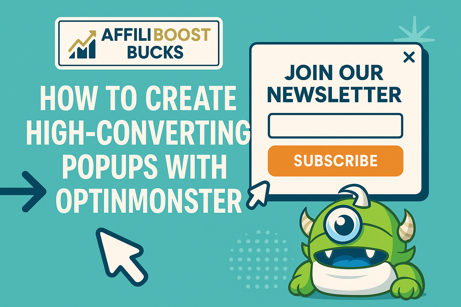
 Boosting conversions on your website isn’t just a matter of driving more traffic. It usually comes down to how well you capture the attention of your visitors, and one of the most effective ways to do that is with a well-crafted popup. If you’ve spent any time in the world of online marketing, you’ve probably heard about OptinMonster. It’s a super handy tool for building popups that actually get people to take action, whether that means signing up for your email list, grabbing a discount, or checking out your latest offer.
If you’re new to OptinMonster or just haven’t had the chance to fully unlock what it can do, you might think popups are annoying or outdated. But when they’re set up thoughtfully, they can totally change how visitors interact with your site. I’m going to walk you through everything I’ve learned about creating high-converting popups using OptinMonster, from the core basics to the more advanced stuff that really takes your results up a notch.
This guide is built for anyone who wants to increase leads, grow an email list faster, or improve sales. I’ll share every step of the process, with plenty of tips and strategies I’ve picked up from using OptinMonster on my own projects. If you’re ready to turn more of your visitors into subscribers or customers, you’re in the right spot.
If not registered with OptinMonster, you can read out “Getting Started with OptinMonster Guide.
Step 1: Get Clear on Your Goals
Before jumping into design, it’s super important to figure out what you actually want your popups to do. A popup can do a lot more than just collect emails. OptinMonster gives you flexibility to create all sorts of campaigns, so it helps to start with a specific conversion goal in mind.
Common Conversion Goals for Popups:
- Grow your email list with a newsletter signup form.
- Promote a sale, discount code, or flash offer.
- Encourage visitors to download a freebie or lead magnet.
- Redirect visitors to a new product or service.
- Recover abandoning visitors with exit-intent offers.
For each goal, think about how success would look. Example: If you want more email subscribers, decide how many new signups would feel like a win each week or month. This keeps you focused and makes it easier to measure what’s working.
It’s also smart to check how each goal fits into your bigger marketing plan. Are you collecting leads to nurture for a big launch? Maybe you want to create a VIP segment for special offers. The more you dig into your “why” at this stage, the easier it is to build popups that make a real impact on your bottom line.
Step 2: Choose the Right Popup Type
OptinMonster is packed with different campaign types. Each has its own job, and picking the right one can make a big difference in your results. Here’s a quick rundown of the main options you’ll find:
- Lightbox Popup: Classic overlays that appear on top of any page. Awesome for capturing attention, especially for main offers.
- Floating Bar: Sits at the top or bottom of the screen. Solid for showing promos without blocking content.
- Fullscreen Welcome Mat: Covers the whole page when someone first lands on your site. Good for getting people excited about something new.
- Slidein: Slides up from the side of the page without being too pushy. Great for lowerkey prompts.
- Inline Forms: Embedded right inside your content for signups that feel more natural.
How to Pick Your Popup Format:
- If you want everyone’s eyes on your message, lightbox and fullscreen popups do the job.
- If you need something subtle that won’t interrupt visitors, try a floating bar or slidein.
- If your offer fits naturally with your blog post or product description, an inline form blends right in.
It’s totally normal to experiment. Some pages might click better with a lightbox, while others get more love from a slidein. You can run AB tests in OptinMonster to compare.
Step 3: Design a Popup That Gets Attention (But Isn’t Annoying)
Every popup needs to look good and match your brand, but it also has to be easy to interact with. The best popups feel inviting, not disruptive. Here’s how I usually approach the design inside OptinMonster:
Tips for Great Popup Design:
- Keep it simple: Avoid clutter. A bold headline, short description, and a single call-to-action usually work best.
- Use colors that stand out: Pick an accent color that pops but still fits your site’s style.
- Add relevant images or icons: A clean graphic or product photo helps draw people in.
- Make forms easy to fill out: Only ask for what you really need. Most of the time, just an email address is enough.
- Don’t forget mobile: OptinMonster makes it easy to preview and tweak popups for phones, which is super important since a lot of traffic is mobile now.
Copywriting That Converts:
- Clear headline: Tell people what they’re getting right away.
- Benefitfocused text: Make it about what your visitor will gain.
- Clickable call-to-action: Use action words. “Get My Discount,” “Download Free Guide,” or “Join Now” all work.
One cool thing I’ve found is that personalizing copy to match the page (like mentioning a product the person just viewed) can improve results a ton. OptinMonster has some handy dynamic text options for that. For instance, if someone is on a specific product page, you can create a popup that references that product by name, making it feel tailor-made and increasing the chance of conversion.
Also consider adding small trust elements like “No spam, ever” or “Unsubscribe any time” below your form fields. This takes away some of the friction new visitors might feel about sharing their information.
Step 4: Set Up Smart Display Rules
One reason people love OptinMonster is the control over when and where popups appear. Instead of blasting every visitor with the same thing, you can show different popups based on what they’re doing. This keeps your offers relevant and avoids annoying your regulars.
Popular Display Rule Options:
- Pagelevel targeting: Only show specific popups on certain landing pages or blog posts.
- New vs returning visitors: Give a special deal to firsttimers or a loyalty bonus to regulars.
- Scroll triggers: Reveal the popup after the visitor has scrolled past a certain point.
- Elapsed time: Wait a few seconds (so people don’t bounce) before showing the popup.
- Exitintent technology: Display offers when someone’s mouse moves toward closing the tab, which is great for catching people before they leave.
- Device targeting: Different popups for desktop, tablet, and mobile users.
Mixing a couple of these rules can make a big difference. For example, using both exitintent and scroll triggers together means your popups only show to engaged visitors who might be thinking about leaving. You can also set frequency caps, so a visitor doesn’t see the same popup more than once a week, for example, helping to keep user experience pleasant.
Step 5: Craft an Offer Worth Converting For
Even a perfectlydesigned popup won’t do much if your offer is a snooze. Offering something people actually want is what gets results. Here are a few ideas that work well for most sites and audiences:
- Discount codes: 10% off or free shipping is an easy win for ecommerce stores.
- Lead magnets: Free ebooks, checklists, cheat sheets, or templates related to your topic. These get people to sign up quickly.
- Giveaways: A chance to win something (even something small) can drive tons of signups.
- Exclusive content: Early access, bonus videos, or membersonly resources often catch attention.
- Webinar or event signups: Popups are pretty good at filling virtual seats.
How to Pick the Right Incentive:
- Match what you’re offering to where people are in your funnel. New visitors might want a lead magnet, while a repeat shopper goes for a loyalty discount.
- Test a couple of different offers to see which gets the clicks you want. OptinMonster makes AB testing really easy.
The more tailored your offer is to your audience and content, the better your conversions will look. And if you’re not sure what to offer, pay attention to the questions your visitors ask most often or the freebies that already get downloaded the most—these can be extra strong incentives for your popups.
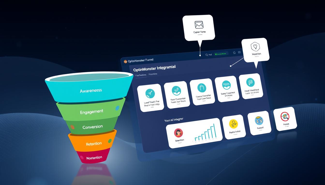
Step 6: Connect Your Popup to Your Email Platform or CRM
A popup that collects email addresses isn’t much use if you can’t actually follow up. OptinMonster works directly with pretty much every major email service provider (like Mailchimp, AWeber, ConvertKit, ActiveCampaign, and more), plus lots of CRM tools for bigger businesses.
Easy Integration Steps:
- In your OptinMonster popup editor, go to the “Integrations” tab.
- Select your email or CRM platform.
- Follow the prompts to connect your account and pick the specific list or segment you want new signups to go into.
- If you want, add tags or custom fields so you know exactly where each signup came from (like “PopupWelcomeOffer”).
Everything’s pretty much point-and-click, and if you run into a snag, the OptinMonster docs have step-by-step guides for almost every provider. Connecting things up right away means new leads don’t just sit in limbo. They’re in your system, ready for your welcome or followup emails.
Pro tip: Set up an automated welcome series in your email platform. That way, when a new contact signs up through your popup, they get a friendly hello and whatever you promised immediately, giving your relationship a strong start.
Step 7: Use AB Testing to Improve Your Results
Even the best marketers can’t always guess what’s going to work best. That’s where AB testing (or split testing) comes in. With OptinMonster, you can create two or more versions of your popup and see which one pulls in more conversions. Here’s what you can test:
- Headline copy
- Popup design (colors, images, layout)
- CTA button text
- Offer or lead magnet
- Trigger timing (like showing after 5 seconds vs 15 seconds)
How I Usually Run an AB Test in OptinMonster:
- Pick one thing to test at a time (like headline or button text).
- Duplicate your original campaign and make a single change.
- Let both versions run with roughly equal traffic.
- Check your analytics after a few days (or longer if you’ve got low traffic).
- Pick the winner, then keep testing new tweaks to keep improving.
Even little changes can add up to big improvements over a few tests. Test headlines, button colors, images, offers, or even when your popup appears—a few seconds sooner or later can change your signup numbers.
Remember to give your test enough time to gather real data, especially if your site doesn’t get hundreds of visits a day. Sometimes, patience leads to much clearer results.
Step 8: Analyze Popup Performance and Update Regularly
Setting your popup live is only half the story. Keeping conversions high means checking in on your results and making tweaks where needed. Inside OptinMonster, you get a dashboard that tracks views, conversions, and conversion rates for each popup. You can see which campaigns are working and which need some love.
Metrics That Matter:
- Views: How many people saw your popup.
- Conversions: How many signed up, clicked, or took your desired action.
- Conversion rate: A percentage showing how many viewers converted.
- Split test results: Easy to compare two campaigns side by side.
If you see a drop in conversion rates, don’t panic. Sometimes traffic quality changes, or maybe your offer isn’t as fresh anymore. Try updating your copy, giving the design a refresh, or adding a new incentive to see if numbers go back up. Seasonal adjustments work too—test a “back to school” promo in late summer or a holiday sale in November, for example.
Monitor your most important landing pages regularly, and rotate offers or test new popups to keep things interesting for return visitors.
Answers to Common Popup Questions
Do popups hurt SEO?
If you follow Google’s guidelines, keeping popups easy to close, not blocking the whole page on mobile, and not bombarding people, there’s nothing to worry about. OptinMonster has settings to make everything Googlefriendly. More details are in Google’s own guide about popups.
How often should I show popups to visitors?
OptinMonster comes with options for setting frequency (like once per visitor, once per session, or only after X days). I like to show most popups to the same visitor just once, but it depends on your offer and how persistent you want to be. If someone already opted in, show them a different campaign or skip popups for them entirely.
Do popups work for every type of website?
Popups can help almost any site, from blogs and ecommerce stores to coaching websites and SaaS products. The key is matching the style and offer to your visitors. Even on quieter sites, a simple exitintent popup can make a noticeable difference in the number of leads you get.
How can I avoid annoying my visitors?
- Use smart targeting and triggers, so people only see what’s relevant.
- Space out how often popups appear to each visitor.
- Make them super easy to close or dismiss.
- Test different formats for mobile users, some designs work a lot better on phones and tablets.
It’s also a good idea to double-check your popups on different devices and browsers to make sure they always look and work as intended. Take an extra minute to check settings like cookie duration so people aren’t seeing the same popup every single visit.
Pro Tips and Advanced Tactics with OptinMonster
- Personalize by referral: Show a unique popup for visitors coming in from specific sites or ads (like a custom offer for Facebook ad clicks).
- Run multistep popups: Start by asking a simple Yes/No question, then show the opt-in form. Sometimes this twostep dance can double conversions.
- Target by location: Show localized promos or announcements to visitors in certain countries or cities.
- Combine with countdown timers: Adding an urgency element makes people more likely to jump in now instead of later.
- Save abandoned carts: Show discount popups when someone’s about to leave your checkout page. This could lower cart abandonment by a lot.
- Sync with onsite retargeting: Offer different popups each time a visitor checks out your site, depending on what they’ve already signed up for.
The more granular you get with segmentation and triggers, the more personalized your popups will feel, and the better they’ll perform. Think about adding quiz style popups to segment visitors further, or using detected interests to serve tailored content. Advanced integrations with your CRM can make your popups feel custom made for each visitor.
Your Next Steps to Popup Success
Creating high-converting popups with OptinMonster is all about understanding your audience, testing what works, and making your offers as irresistible as you can. Start with a single, clear goal and the right popup type for your page. Keep the design sleek, set smart display rules, and don’t forget to hook up your integrations so you can nurture those new leads. If you revisit your campaigns regularly and try out new tactics, there’s a good chance you’ll keep seeing steady improvements.
Quick Action Plan for Your First Popup:
- Decide whether your main goal is leads, sales, or something else.
- Pick a popup type (start with a lightbox or slidein).
- Write a simple, benefitdriven headline and CTA.
- Set up targeting rules so your popup shows up in just the right places.
- Integrate with your email provider or CRM right from the start.
- Check your analytics after a week and test a small tweak to keep improving.
What campaign are you excited to try with OptinMonster? Drop your thoughts or questions below, I’m always happy to share more tips!